

The Activistss Club
Brand Palette
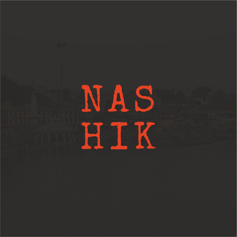
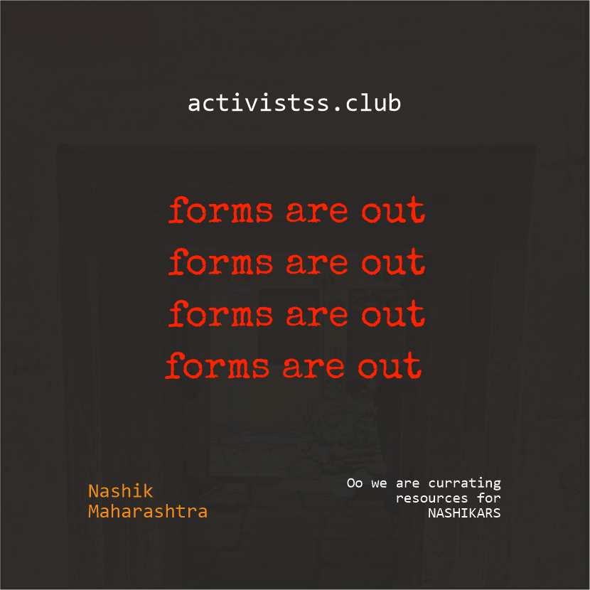
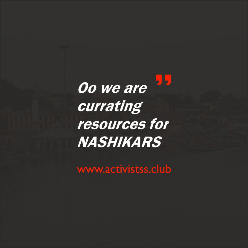
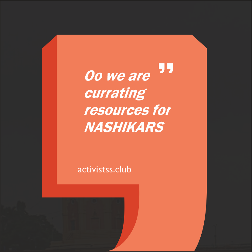
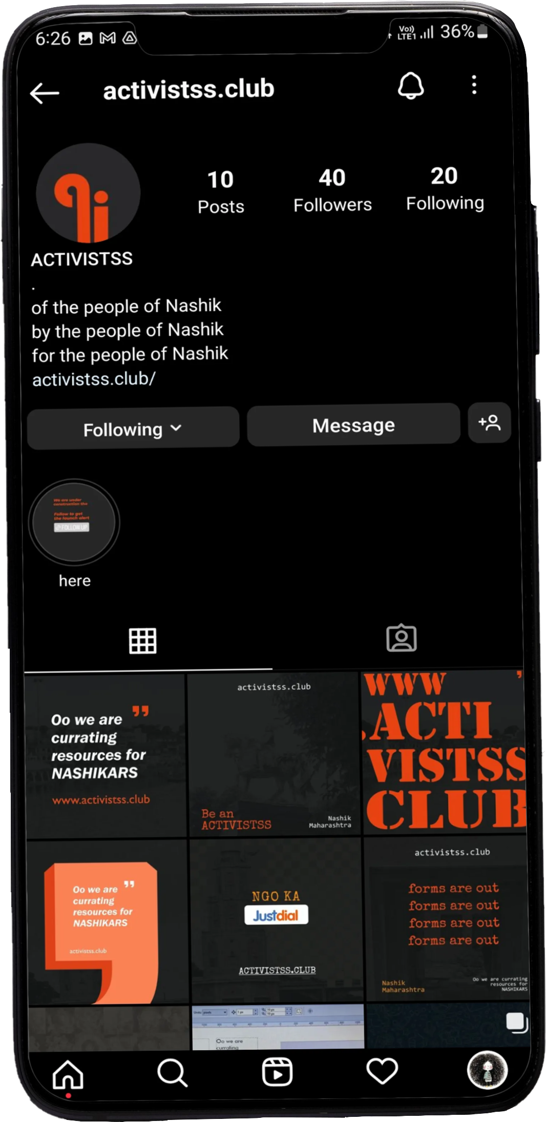
Activists Club is an initiative launched in Nashik, Maharashtra, offering a website that lists emergency contacts for NGOs, rescue teams, and other public welfare organizations. The site also features information on community-focused clubs in Nashik, making it easier for individuals to support and volunteer their time and resources. By connecting people with these organizations, Activists Club plays a vital role in providing access to emergency services and fostering community engagement.
Project Paradigm:
The Activists Club project required a platform that could seamlessly connect individuals with emergency contacts for NGOs, rescue teams, and public welfare organizations in Nashik while fostering community engagement. The initiative aimed to make resources easily accessible and encourage volunteering by providing information on community-focused clubs. The project expected a user-friendly interface and a strong brand identity to effectively communicate its purpose of uniting people and organizations for social welfare and emergency response, ensuring the initiative’s impact and outreach were maximized.
Logo

The primary elements in the logo designed for the brand are the alphabets ‘a’ and ‘i’ in red on a black background (the dominant colors from the brand’s palette). The “a” stands for “activistss club”, while “i” symbolizes an individual. However, the “a” and “i” together resemble two distinct human figures, this essentially reflecting on the “people-centric” approach adopted by the brand with in layman term shouting “this brand/project is about all people and activists coming together”.
Color Palette

Background
Color

Primary
Color

Secondary
Color

Highlight
Color
For this project, a bold color palette of black, red, and white was primarily used, with selective accents of yellow and orange to create a striking visual impact. Red, in particular, was utilized to symbolize urgency and danger, effectively drawing attention to critical information such as emergency contacts. The combination of these colors was strategically chosen to evoke power, energy, and alertness, while yellow and orange highlights added warmth and vibrancy. These colors were carefully applied to enhance contrast and depth, guiding the viewer’s focus and ensuring the design clearly communicates the project’s purpose.
Fonts

Headings: Stencil

Paragraph: Gotu
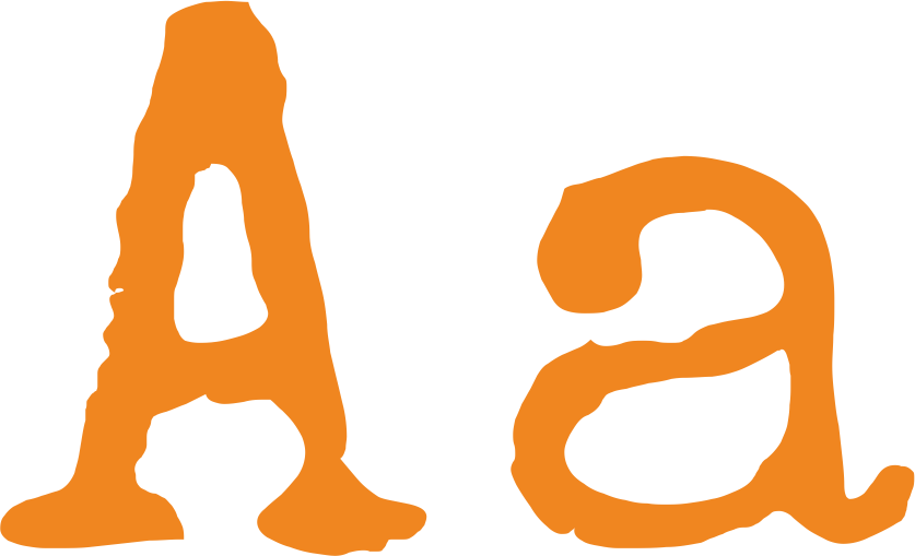
Highlights: Special Elite
Social Media Posts