Nashik Bites
Nashik Bites is a premium Indian snack brand bringing authentic flavors to the Middle East, particularly the UAE and Dubai. Renowned for its superior quality and traditional recipes, the brand celebrates India’s rich culinary heritage through a diverse range of products, from savory namkeens to indulgent sweets. The designs created for Nashik Bites encapsulate its ethos, emphasizing authenticity, excellence, and a connection to Indian culture, making it a standout choice in the global market.
Project Paradigm:
• Logo Design
• Brand Palette
• Packaging Design
• Mini Website
Logo Design
The logo for Nashik Bites is thoughtfully crafted to visually represent the brand’s identity and product essence. A circular design serves as the central element, symbolizing papad, the brand’s primary product, and a staple of Indian snacks. A distinctive bite-shaped cut at the top right of the circle creatively highlights the crunch factor that defines the brand’s offerings, including items like sabudana sticks and kurdai.
The circle also features the brand name, Nashik Bites, prominently placed in bold yet approachable typography, reinforcing recognition and trust. To add a touch of warmth and connection, a subtle smile-like line outlines the bottom-left curve of the circle, representing satisfaction and joy that comes with every bite. This combination of elements creates a logo that is not just visually appealing but deeply tied to the brand’s ethos of authentic, premium-quality Indian snacks.
Brand Palette
Colors Palette:


Sp. Fonts:
Title
A B C D E F G H I J K L M N O P Q R S T U V W X Y Z
a b c d e f g h i j k l m n o p q r s t u v w x y z
Headings
A B C D E F G H I J K L M N O P Q R S T U V W X Y Z
a b c d e f g h i j k l m n o p q r s t u v w x y z
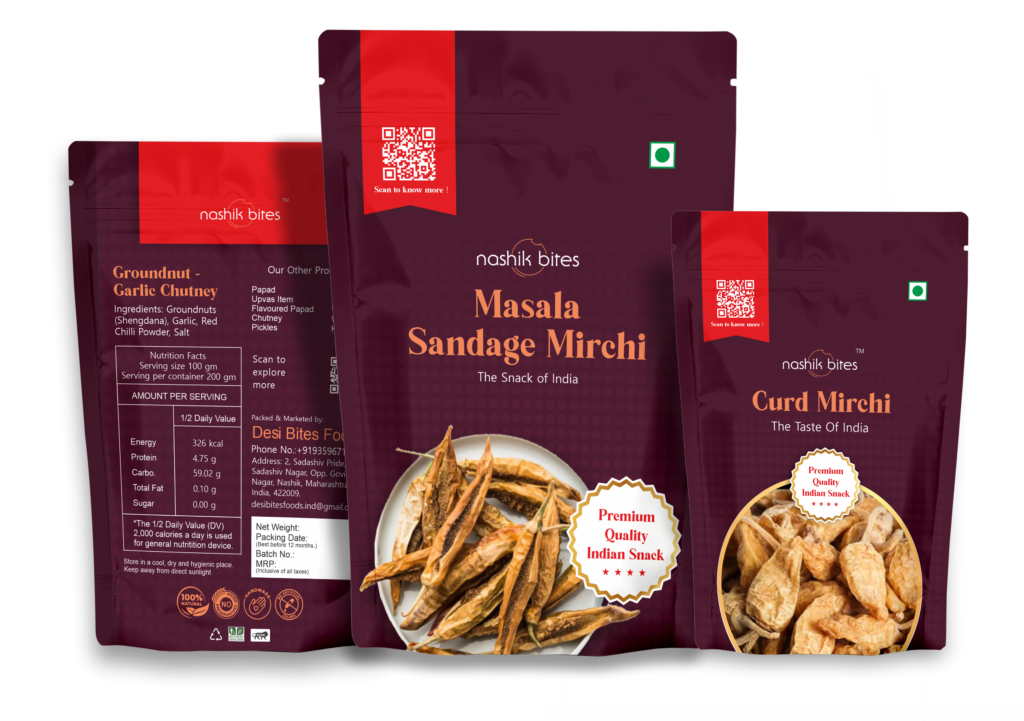
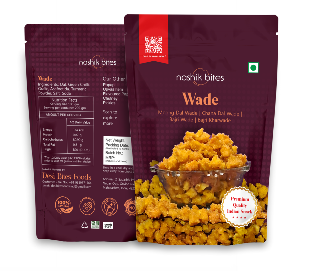
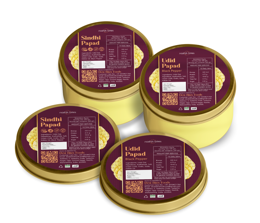
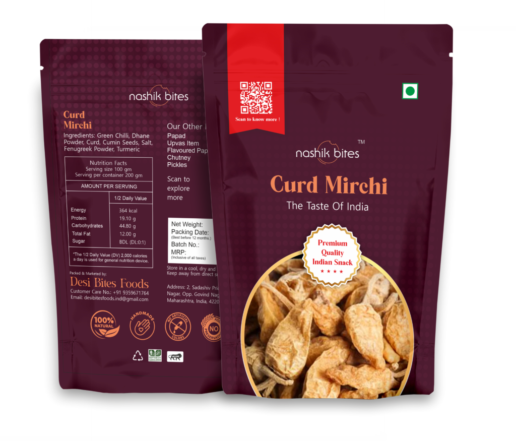
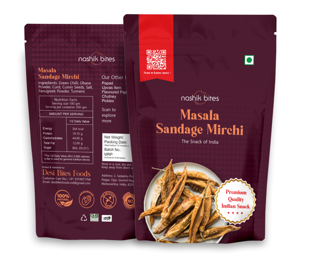
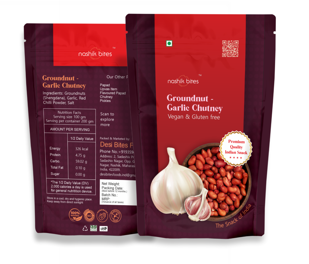
Packaging Design
The packaging design for Nashik Bites is a vibrant yet elegant representation of the brand’s premium identity. The rich Merlot background serves as the signature color, evoking sophistication and authenticity, while also providing a strong contrast for other design elements. A fading dot pattern subtly enriches the background, adding depth and texture without overwhelming the design.
Headings are highlighted in a warm Peach Echo, drawing attention with a welcoming and appetizing appeal. For text and general information, white typography ensures clarity and readability, paired with carefully selected signature fonts that establish a unique brand identity. Key elements, such as shapes, use white backgrounds with golden outlines, creating a luxurious and premium feel, while a Fiery Red is sparingly used to emphasize specific features or details. This cohesive design approach ensures each package reflects the brand’s dedication to quality and authenticity while standing out on shelves with a memorable and polished aesthetic.
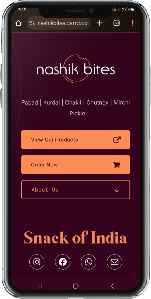
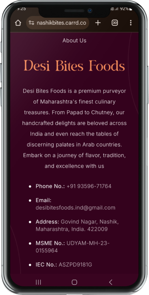
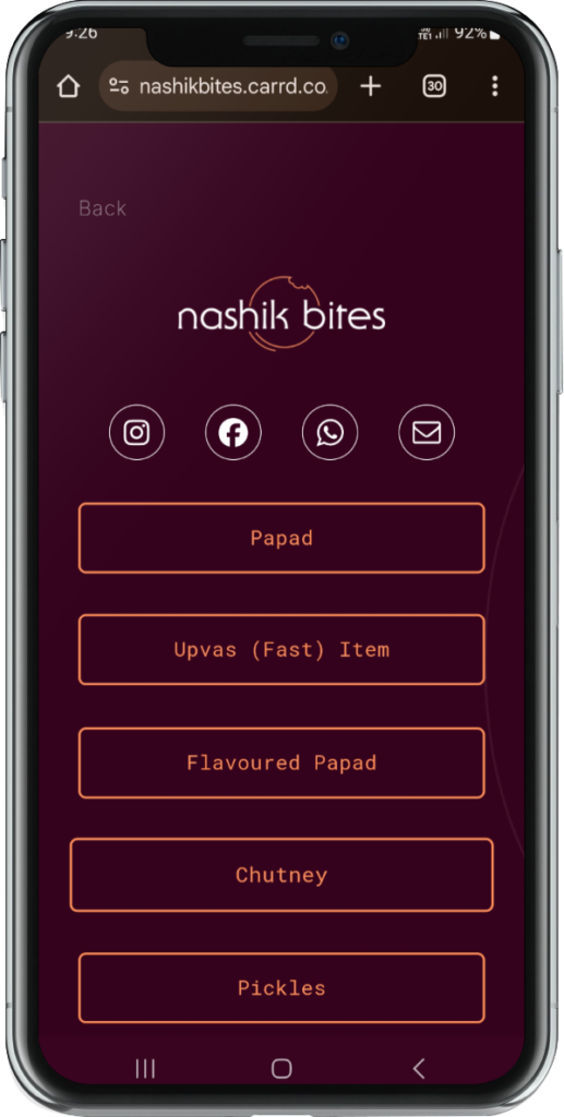
Mini Website
The mini website for Nashik Bites is designed to reflect the brand’s premium and authentic identity, using the Merlot background color and Peach Echo for headings and call-to-actions, creating a sophisticated and cohesive look. The website features a clear structure with sections on product offerings, company information, and contact details. Product pages showcase high-quality images and descriptions, highlighting key features like authenticity and crunchiness, while the Fiery Red accentuates important elements. The website is user-friendly, with easy navigation, a contact form, and social media links, ensuring a seamless experience that aligns with Nashik Bites’ dedication to premium, authentic Indian snacks.